The 5 UX decisions that make or break an MVP
Most MVPs fail on five UX decisions made in the first week. What they are, why they matter more than polish, and how to get them right early.
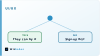
When an MVP fails, the review usually blames features or polish. It is nearly always neither.
Most MVPs are quietly sunk by five decisions made in the first week, before a single feature exists and before anyone calls it design. They cost nothing to get right early and a great deal to fix once people have already left.
Here they are, in the order they matter.
Is the one thing obvious in five seconds?
Every product does several things. Every good product makes one of them obviously the point.
If a new user cannot tell within about five seconds what this is for and what to do first, they leave. No number of features brings them back, because they never saw the features.
This is a decision, not an accident. You choose the single most important action, make it the loudest thing on the screen, and let everything else become quieter.
The hard part is resisting the urge to show everything at once. A busy first screen is a product that has not decided what it is, and users read that instantly even if they could not explain why.
What does the screen say when it is empty?
Every new user starts with nothing. No data, no history, no content.
Teams design for the full, thriving version of the app and treat the empty version as an afterthought. So the first thing every user sees is a blank screen that effectively says "you are on your own".
That blank screen is where most new users quit, and the analytics rarely make it obvious, because leaving looks the same as being busy.
The empty state is your best onboarding surface. It should show what the product looks like once it is working, and offer one clear, easy first action to get there. Design it as carefully as the full version, because it is the version everybody sees.
What happens when something goes wrong?
Forms get submitted twice. Connections drop. Payments fail. People type the wrong thing into the wrong box.
None of this happens in a demo. All of it happens constantly in the real world, and how your product behaves in those moments is not an edge case. It is where trust is won or lost.
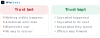
A calm message that explains what happened and what to do next is worth more than a feature. A silent failure, or a wall of technical language, tells the user your product is fragile. They will believe it, and they are not entirely wrong.
The detail people miss most often is keeping what the user already typed. Losing a filled-in form is a small technical event and a large emotional one.
How many steps to the payoff?
Count the taps between arriving and getting the thing they came for. Then remove some.
Every step is a place someone can hesitate, get confused, or decide this is not worth it. MVPs are especially unforgiving here, because the user has no loyalty yet. Nobody pushes through friction for a product they are not sure about.
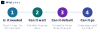
This does not mean cramming everything onto one screen. It means being honest about which steps are truly necessary now, and which exist because they were easy to build or because a competitor has them.
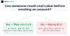
Account creation is the usual offender. A lot of products ask people to sign up before showing them anything worth signing up for.
Does it use your words or theirs?
Your internal vocabulary is not your users' vocabulary.
The labels and messages that feel natural to the team who built the thing are often meaningless to someone using it for the first time. "Provision a workspace" means nothing to a person who wants to "start a project".
Getting the words right is among the cheapest and most neglected improvements available. It costs an afternoon and changes how the whole product feels.
Use the language your users already use for the problem you solve. If you are not sure what that is, that itself is worth knowing, and a few conversations will tell you more than another week of building.
These five are settled at the very start of our MVP process, before any production code exists.
Why do these beat visual polish?
Notice what is not on the list: animation, illustration, a distinctive visual style.
Those matter, later. They make a good product feel better. What they cannot do is rescue a product where the main action is unclear, the first screen is cold, errors are baffling, the path is long, and the words confuse people.
Polish amplifies a working experience. It cannot create one.
A plain-looking MVP that gets these five right will beat a beautiful one that gets them wrong, every time. And the beautiful one usually costs more, which makes the mistake harder to admit.
The encouraging part is that all five are decisions rather than budgets. They cost thought, not money, and they are cheapest before anything is built. That is why we settle them in week one with a clickable prototype, while changing them still takes an hour.
Frequently asked questions
What actually makes or breaks an MVP's user experience?
Five decisions made in the first week: whether the main action is obvious within about five seconds, what the screen says when it is empty, how the product behaves when something fails, how many steps stand between arriving and getting value, and whether the words are the user's or yours.
Why does the empty state matter so much?
Because it is the version every user sees first. Everyone starts with no data and no history, yet teams design for the full app and leave the empty one blank. It is the best onboarding surface you have: show what the product looks like working and give one clear first action.
Is visual polish not what makes a product feel good?
Polish amplifies a working experience but cannot create one. Animation and a distinctive style matter once the fundamentals are right. They cannot fix an unclear main action, a cold first screen, confusing errors, a long path to value, or language nobody understands.
How early should these decisions be made?
Week one, before production code exists. All five cost thought rather than money, and they get more expensive to change with every week that passes. We settle them with a clickable prototype so the fundamentals are agreed while changing them still takes an hour.
How do I know if my first screen is clear enough?
Show it to someone unfamiliar for five seconds, take it away, and ask what the product does and what they would do first. If they cannot answer, the screen is not clear yet. Do this with three or four people and the pattern in their answers tells you what to fix.
What is the most common mistake in an MVP flow?
Asking people to create an account before showing them anything worth creating an account for. Wherever possible, let someone reach the value first and ask for commitment second. If sign-up genuinely must come first, explain in one line what they get for it.
The short version
Make the main action obvious. Design the empty screen as carefully as the full one. Handle failure calmly and keep what people typed. Count the steps to value and cut them. Use your users' words.
None of these need budget. All of them get more expensive every week you leave them.