Custom Dashboard vs Off-the-Shelf BI
BI tools answer questions your data model already supports. Here is the test that tells you when a metric needs to be defined in code instead.

The pitch for a BI platform is that you connect your data and answers appear. That is true for a particular shape of question and quietly false for another, and the difference is not about how much data you have. It is about how much interpretation sits between your raw records and the number a person actually wants to see.
What a BI tool assumes about your data
Every BI platform is built on an assumption: that your data is already in a shape where questions can be asked of it. Tables with clean keys, consistent grain, dimensions that mean the same thing everywhere. Given that, these tools are genuinely excellent — drag a field, get a chart, share it, and non-technical colleagues can explore without asking anyone.
The assumption holds more often than engineers expect. If your question is "revenue by region by month" and revenue is a column and region is a column, a BI tool will beat anything you build, and building instead would be an expensive way to arrive at the same chart.
Where it stops holding is when the number somebody wants does not exist in your data and cannot be derived by aggregation alone. "Active customer" is the standard example. Almost nobody has an is_active column that means what the business means. Active usually means something like: logged in recently, or has an open subscription, unless they are on a paused plan, excluding internal accounts, and counting a multi-seat account as one customer rather than several.
That definition is business logic. It has exceptions, it changes, and it must be identical everywhere or two dashboards will disagree and both will be distrusted.
The question that actually separates them
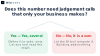
Not "how much data" and not "how many users". This one: how many steps of interpretation sit between a stored record and the number on the screen?
If the answer is zero or one — read a column, maybe sum it by a dimension — buy a BI tool. You will get a better result faster than you could build, and your colleagues will be able to answer their own questions without a ticket.
If the answer is three or more, and those steps encode judgements only your business makes, that logic has to live somewhere deliberate. A BI tool can express it, usually through calculated fields or a semantic layer, and this is exactly where the trouble starts — because that logic now lives inside the reporting tool rather than beside the systems it describes. It is hard to test, hard to version, invisible to anyone not in the tool, and it drifts as people build variants.
The second question worth asking: who needs to change the definition, and how often? A settled metric is fine anywhere. A metric still being argued over needs to live somewhere with review, tests and history, because the argument will continue and each round changes the numbers.

The failure modes, in both directions
Building what you could have bought. A team writes their own charting layer for questions a BI tool answers out of the box, and now owns a reporting product nobody asked for. Every new question becomes a development task, which is precisely the bottleneck BI tools exist to remove. If your dashboard is mostly generic charts over clean tables, you have built the wrong thing.
Encoding the business in the reporting tool. The mirror image, and more common. The definition of your central metric ends up as a calculated field inside a dashboard. It works. Then someone builds a variant for a different team, tweaks the logic slightly, and now two numbers describe the same thing differently. Nobody can say which is right because neither definition is written down anywhere reviewable.
Both failures come from the same missing decision: nobody drew a line between where the logic lives and where it is displayed.
The arrangement that usually works
The version we see hold up over time is not either-or. It is a line drawn deliberately.
Definitions live in code, close to the data, under version control and with tests. Not in a dashboard, not in a saved query, not in someone's head. Each important metric has one implementation, and changing it is a reviewed change with a history — so when a number moves, you can find out why.
That layer publishes results into a place both worlds can read: a set of derived tables or a small API. Then the BI tool points at that rather than at raw records, and it does what it is genuinely excellent at — letting people slice and explore without engineering help — but over numbers that already mean the right thing.
Custom views get built only where they earn it: an operational screen that needs live data and an action button, a customer-facing view where a generic BI embed would look wrong, or a workflow where reading the number and doing something about it belong on the same screen. That last case is the strongest argument for building, and it is not really a reporting requirement at all — it is a product one.
If you are somewhere along the top of that map, the useful next step is not evaluating tools. It is writing down the definition of your three most important numbers, exactly, including the exceptions. If that is difficult — and it usually is — you have found the work, and it is the same work whichever tool you eventually point at it. That metric layer is the kind of thing our web and AI engagements tend to start with, usually as a free prototype over a copy of real data.
Frequently asked questions
When is a BI tool clearly the right answer?
When the numbers people want are a column or a simple aggregation over clean tables. In that case a BI tool beats anything you would build, and lets colleagues answer their own questions.
What is the strongest sign you need something custom?
A metric whose definition needs several judgement calls with exceptions. That logic has to live somewhere testable and versioned, not inside a reporting tool.
Why is defining a metric in a dashboard risky?
Because it cannot easily be tested, reviewed or versioned, and it gets copied into variants. Two dashboards then disagree about the same number and both lose credibility.
Can we use both?
That is usually the right answer. Define metrics in code, publish the results, and point the BI tool at those so exploration happens over numbers that already mean the right thing.
What makes a custom view genuinely worth building?
When reading the number and acting on it belong on the same screen. That is a product requirement rather than a reporting one, and no BI embed handles it well.
Where should we start?
Write down the exact definition of your three most important numbers, including the exceptions. The difficulty of that exercise tells you which side of the line you are on.